Boomering Logo Design
Creating a fresh start for seasoned professionals.
Agency
Deloitte Digital
Launch
2025
Role
Creative Lead and Designer
Intro
Boomering is a digital platform that reconnects experienced professionals from the Boomer generation with purposeful work through mentoring, collaboration, and skills-based matching. We were brought on board ahead of the platform’s launch to develop a new logo and foundational brand elements that reflect Boomering’s forward-thinking mission. The brand bridges generations and combats knowledge loss in the workforce with optimism and clarity.
Designing for
trust, tech, + transition
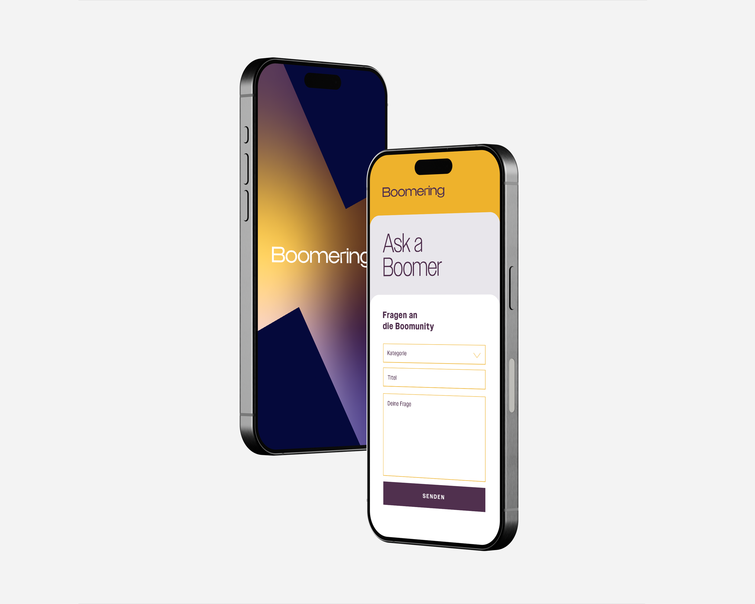
The task was to visually introduce Boomering to the world with a minimal but meaningful brand identity. The solution needed to appeal to two very different audiences: tech-savvy start-ups and seasoned professionals, while conveying credibility, warmth, and a sense of forward movement. The logo also had to work flexibly across digital and app contexts.
Professional, modern
and quietly optimistic.
The resulting identity gives Boomering a recognisable and approachable starting point for growth. The logo, colour palette, and typography toolkit were designed to feel optimistic, adaptable, and digital first. With these foundations in place, Boomering can now begin rolling out its platform, connecting wisdom with fresh ideas and showing that the good ones really do come back.
Crafting the elements
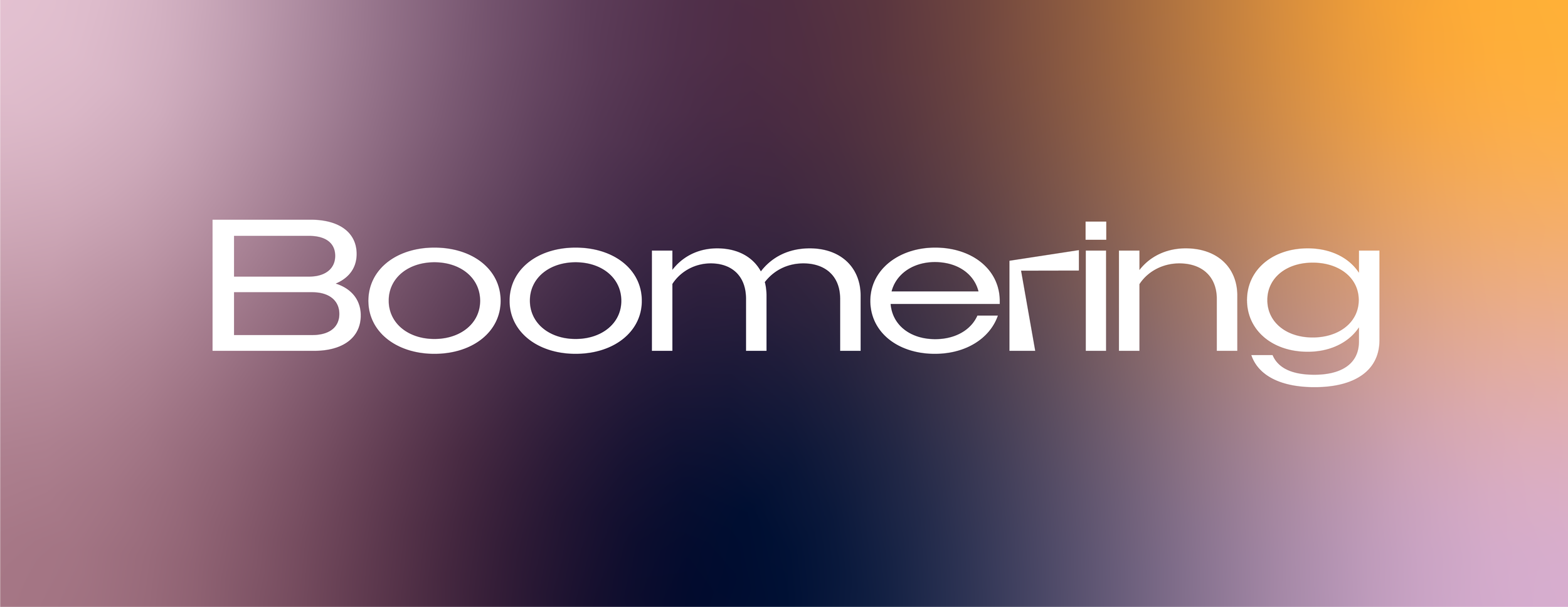
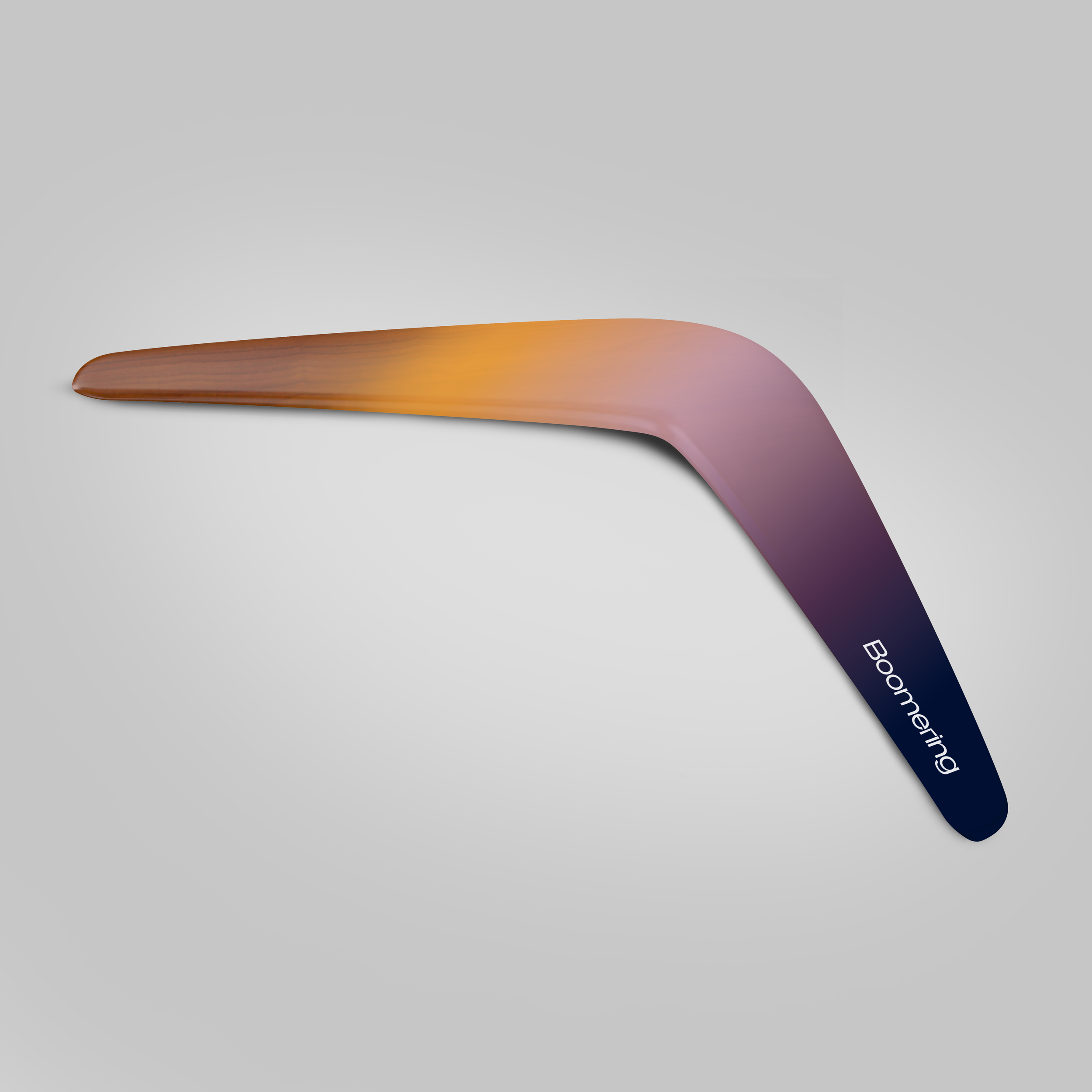
The creative concept focuses on the letter “r” from the Boomering name. It acts as a visual hook and a symbolic anchor.
This approach gives the brand a memorable shorthand while avoiding overused boomerang tropes. The direction of the glyph suggests movement back to something valuable. The overall width of the wordmark helps establish a strong, calm sense of presence. It is confident without shouting, offering a visual identity that can stand up in corporate contexts but still feels fresh and human.
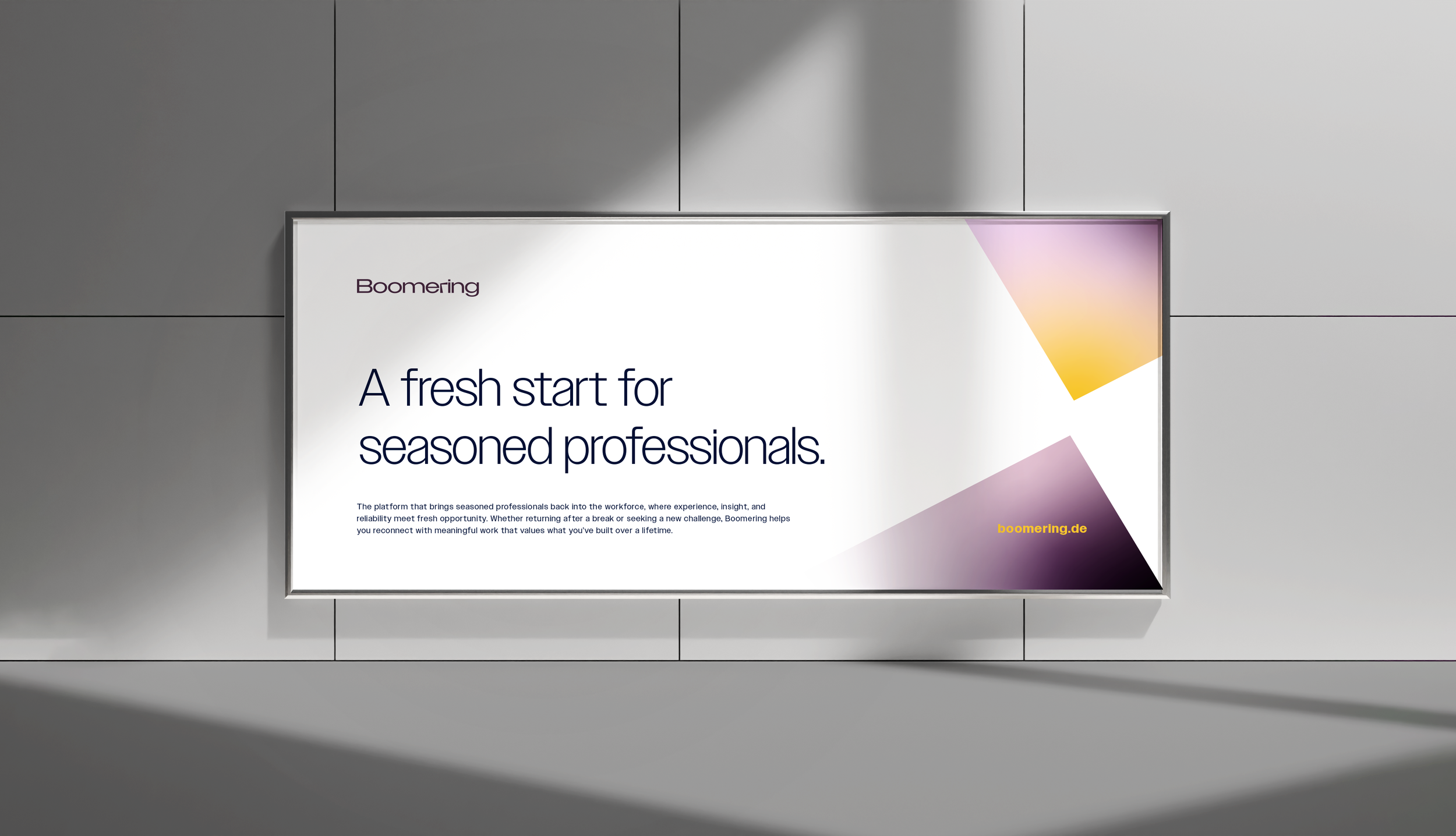
The colour palette balances calm professionalism with subtle warmth. Midnight and Platinum provide clarity and contrast, while Lavender and Violet add a human touch. A small hit of Carrot orange brings gentle energy where needed.
Typography is clean and approachable, chosen for its legibility and modern feel. It supports a brand voice that’s clear, digital-first, and quietly confident.
This identity gives Boomering a thoughtful foundation to build from: professional yet human, clear yet flexible. With a logo rooted in purpose and a brand system designed for both clarity and connection, Boomering is now equipped to launch with confidence and grow into the platform it envisions becoming.
Creating clarity across age and ambition
The Team
Strategy
Matthias Höckh, Strategy Lead
Creative
India Armstrong, Creative Lead and Designer
All work presented here has been developed for different companies, brands and agencies. All intellectual property rights reserved for these entities and their respective clients.


