
Backpacker Cars Australia Rebranding
Helping travellers hit the road with confidence.
Agency
Studio itch
Launch
2026
Role
Creative Director
Intro
Backpacking across Australia is a rite of passage for thousands of travellers every year, yet the process of finding a safe, road‑ready vehicle is rarely straightforward. The market is fragmented, the standards are inconsistent, and the experience is often more stressful than it should be. Backpacker Cars Australia (BCA) set out to change that.
What began as a small operation built by two travellers has grown into a nationwide service dedicated to preparing refurbished and fully equipped vehicles for the road. Their goal is straightforward. Make the experience feel easy, trustworthy and ready from the moment the journey begins. The brand needed an identity system that reflected that same clarity and confidence.
The start of an exciting journey
In 2025 Studio Itch was brought in to redefine and rebuild the identity for BCA. The company had grown quickly and the brand could not keep up. They needed a clearer structure for their brand architecture, stronger differentiation in a crowded market, and a visual identity that finally expressed the values they lived by every day.
The process began with strategic conversations to align the ambition of the founders with a direction the brand could truly own. Once the strategy was anchored, the creative work accelerated. Every round of feedback strengthened the connection between the strategy and the emerging identity. The goal was a system that felt confident, coherent and immediately recognisable.
The result was a complete transformation. A unified brand architecture, a visual identity that stands apart from the noise of the market, and a brand that finally reflects the honesty, reliability and practical spirit at the core of BCA.
“
We've been working with India Armstrong from Studio Itch for the past 8 months, and honestly, it's been great. She recently took on our company rebrand and absolutely nailed it.
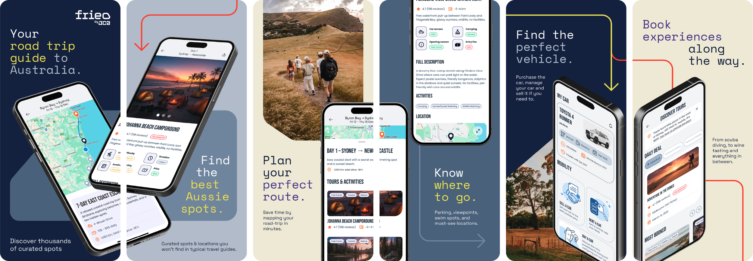
What really stood out was how she kicked things off. The early meetings where she got to know us, what we're about, and where we're headed were super helpful and set the whole thing up perfectly. She delivered the whole package: a fresh new company logo, a logo for our app Frieo, a gorgeous style guide that keeps everything consistent, and even our van branding. She got it all done on time, no fuss.
Couldn't recommend India and Studio Itch more. If you need someone reliable who actually gets your vision, she's your person.
”
— Silas Westerweller
BCA Founder

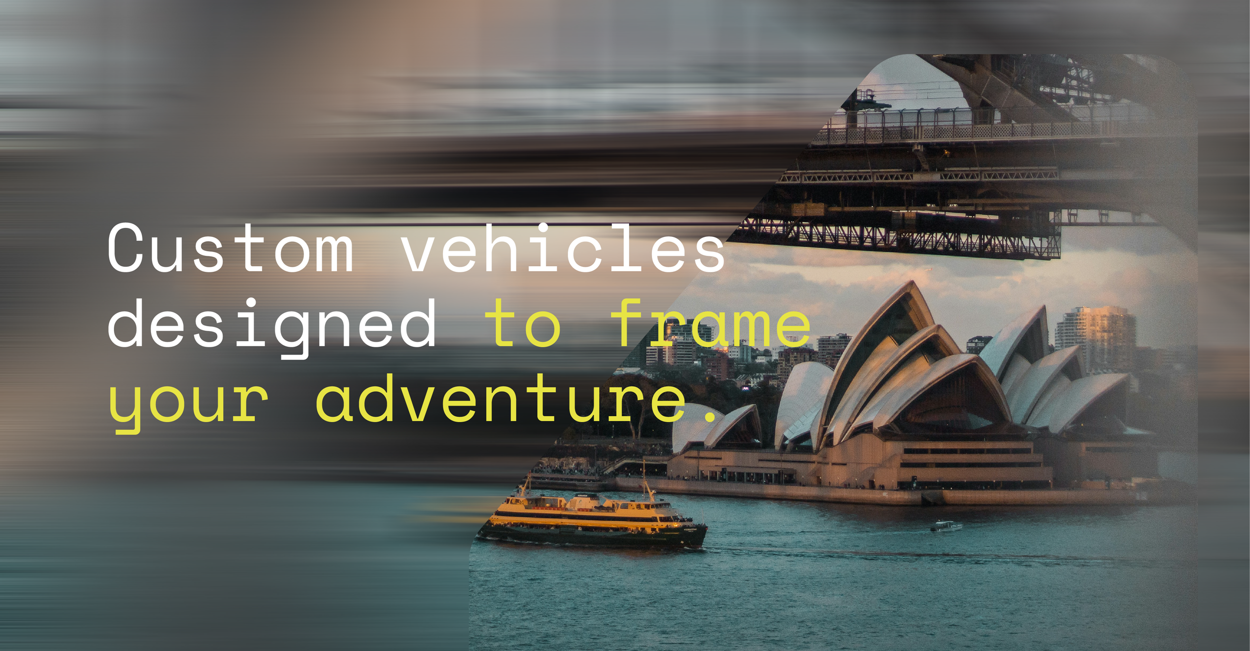
Movement in focus.
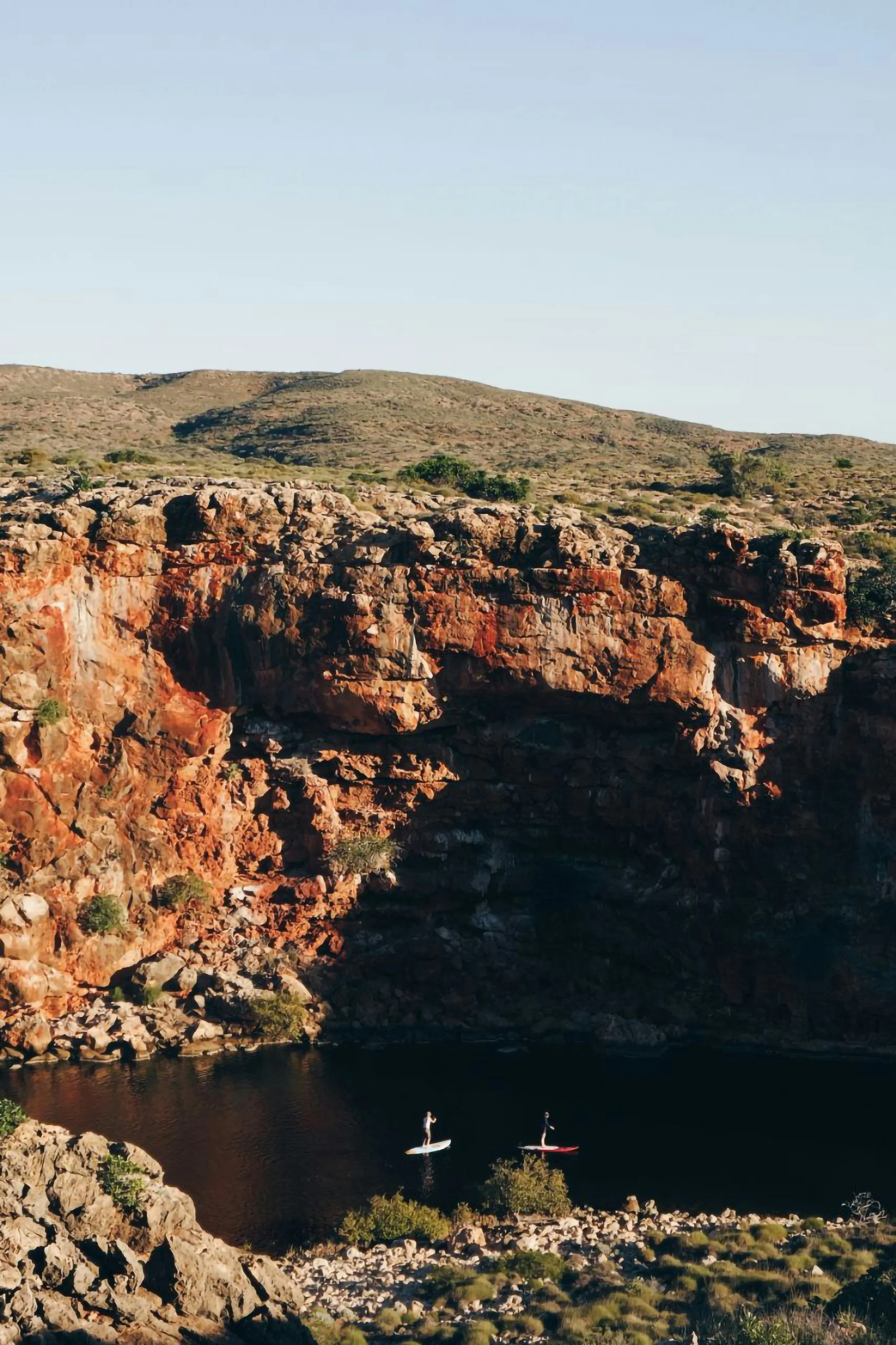
A car keeps you moving. A van invites you to slow down. Its windows act as frames for the world outside, shifting between motion and stillness. This idea informed a visual approach that captures both the freedom and the reflection that define life on the road.
The Visual Rhythm
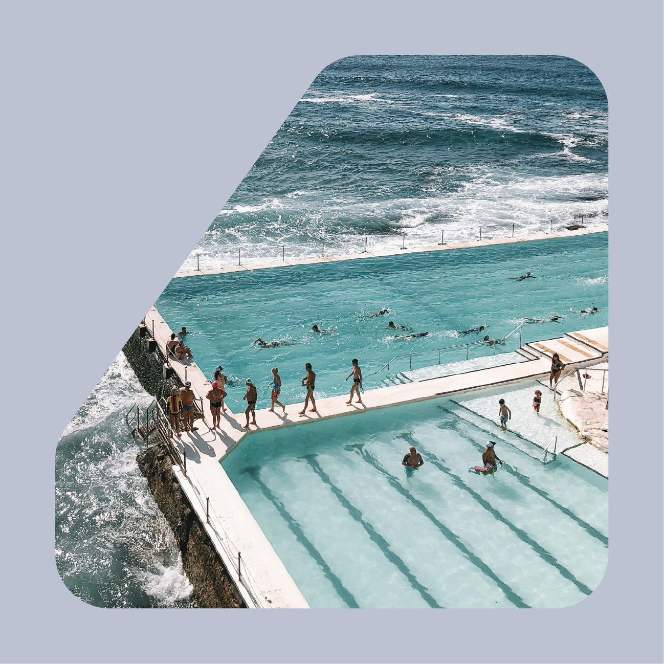
The Frame
Captures the quiet moments of pause along the journey, shaped by the viewpoints of the van itself. Each window becomes a natural composition, grounding the identity in the calm, steady rhythm of travel.

The Focus
Highlights what matters most in any moment. It brings attention to the details, the people and the experiences that define the journey. It adds intention, clarity and a sense of presence.

The Flow
Expresses the balance between motion and stillness on the road. Travel moves and blurs around you, yet the moment remains calm and present, creating the emotional rhythm that anchors the entire visual system.

Crafting the Identity
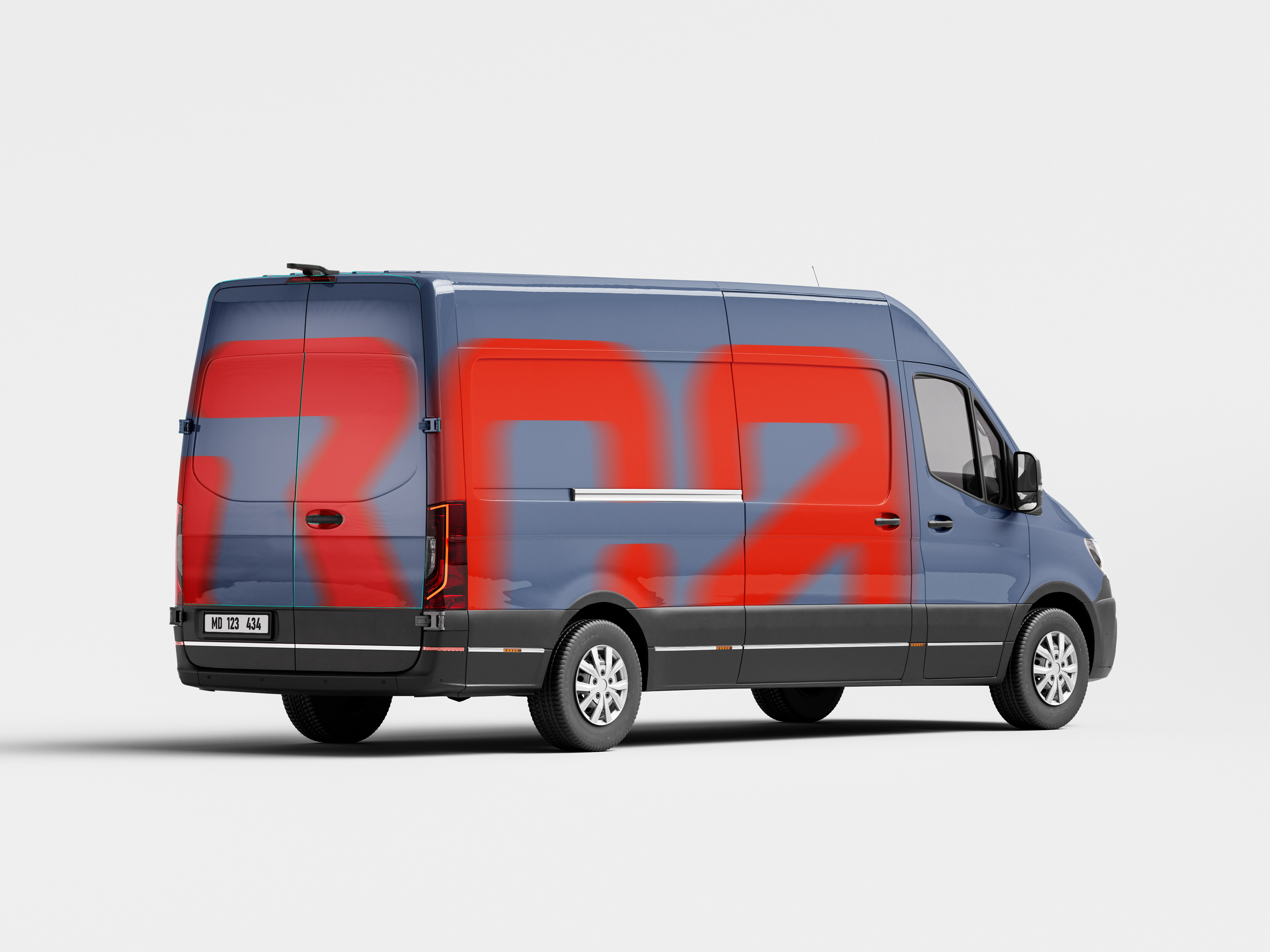
The foundation of the logo takes its form from the blueprint drawings of the vans BCA rebuilds and adapts. By abstracting the core geometry of these conversions, the mark reflects the craft, practicality and hands‑on engineering at the heart of the brand.


As our core identity concept stems from the windows on the side of a van, so too does our logo. Using the shapes as the basic forms, we have created a logo that is as secure and trusted as our products and as adventurous and fun as our customers changing lifestyle.

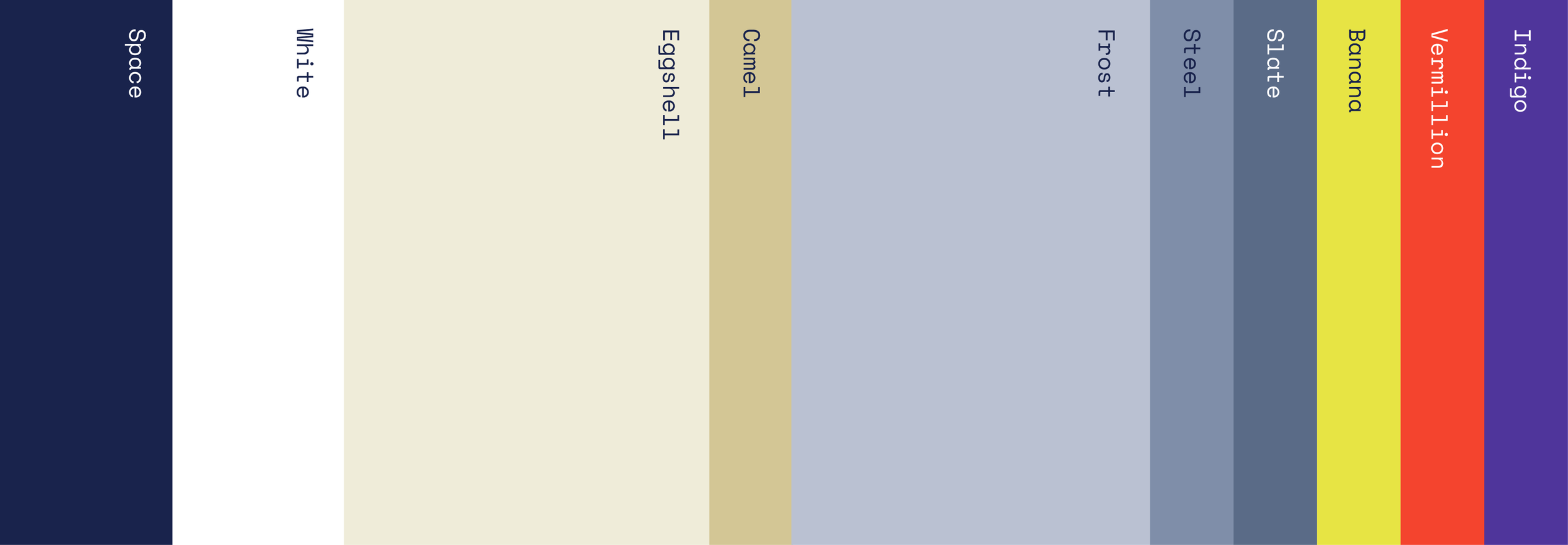
To mirror the energy of a moving design system, we have a bright and vibrant colour palette. The combination of the grounded base colours and the zesty accent colours further illustrates the duality of the whole design system.


The Team
Strategy
Tom Cooke, Strategic Director
Creative
India Armstrong, Creative Director
All work presented here has been developed for different companies, brands and agencies. All intellectual property rights reserved for these entities and their respective clients.